Hey guys!! I haven’t had a chance to talk to you all in a few weeks and I must say I’ve missed all of you. So today we’re going to keep things a little fun and have our first Logo Design Round-Up. The following logos are some of our best work and there’s a lot more where these came from. Before any of our clients receive their amazing new logos there’s a few steps we have to take to come up with the perfect finished product. Some may think that a logo is just some text and maybe some nice clipart, but it’s more than that. Great designs actually take some thought, it’s all about the perfect combination. Therefore, in order for us to come up with the perfect logo it takes a mix of the clients vision and our creative genius. And, we usually get it right every time. So, without further ado take a look and our Logo Design Round-Up, maybe you’ll get some inspiration for your logo!
1.Hair Geneticks
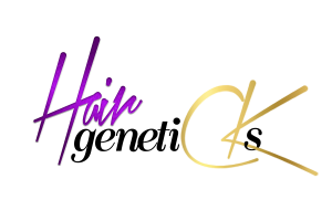 Hair Geneticks is a online hair boutique specializing in an array of virgin hair extensions. It is “The merge between LUSTFUL lengths and PURE virgin hair and SUPERIOR customer service. [They] are the epitome of TASTE and elegance.” To find out more about Hair Geneticks visit them on facebook and follow them on Instagram.
Our company actually worked on the Hair Geneticks logo over a year ago and it still works for their industry. If you worry about trends the same way we do, you’ve noticed the similarities in all hair industry logos. Most beauty logos utilize the colors purple and pink. They use these colors because when you ask a group of girls/women what they’re favorite colors are, they’ll most likely say either pink or purple. Now if you asked me I’d say orange but that’s just my personal preference. Any who, so when creating Hair Geneticks logo it wasn’t a surprise they chose purple as their main color. We also decided to incorporate a metallic shine because all girly girls love things that shine.
2. Fast Custom Print
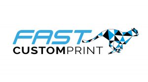
Fast Custom Print is a print shop specializing in all your t-shirt printing needs and getting them to you as quickly as possible. For their logo they wanted something that symbolized quickness which is why we chose to use the cheetah as it’s emblem. As you all know, the Cheetah is the fastest animal in the jungle and can run up to 75 miles an hour. And fast custom print prides themselves in getting you all your printed items as quickly as possible.
Not only did we utilize the Cheetah for this Fast Custom Print logo, you’ll also notice that even the font we chose indicates speed. What makes this logo so great is the movement it creates. If you take a look at other logos with the word fast or the logo is about speed the logo will have some type of movement. This doesn’t mean it’s actually going to move – although some logos may actually move – but it’s about the feeling you get when looking at it. If you get the feeling of speed or since of urgency when looking at this logo, we’ve done our job. Also when it came to choosing the right colors for this business we wanted you guys to get a sense of trust. And, if you read our previous post about choosing the right colors for your business you’ll know that blue is a very trusting color.
3. Lallion Counseling and Consulting Group
The LCCG is located in Canada. The client actually did not choose this particular logo design. However, the detail in the tree is some of our best work and we thought you might like to take a look. Especially since we had a lot of fun creating it.
When you think of counselors you often think of piece and serenity. You’re hoping that once you speak with them you’re going to leave out calmer than you were before and have some piece of mind. And, that’s exactly how we wanted you to feel when looking at this logo. Trees are often a symbol life, peace, and balance, which is why some seek counseling in order to balance out their lives. Also, instead of using leaves like normal trees we decided to incorporate circles to act as the tress leaves. The circles were a great addition because they symbolize the wholeness you wish to achieve.
4. Hiist
This particular business we cannot currently speak on as it is still in the process of ironing out all if it’s kink’s. However, it is still a pretty great logo. Just the sight of the logo makes you wonder what they’re all about.
Here’s another “need for speed” logo we created. Just like the Fast Custom Print logo the Hiist logo has movement. It even has speed marks just in case you weren’t sure that the car is going fast. And, as you all know the color green means go, which is why we chose to incorporate green into this logo.
5. Philly Cheesesteak Tour
If you haven’t heard about Philadelphia’s Famous Philly Cheesesteak Tour you have definitely been under a rock for the past year. Philly Cheesesteak Tour takes you on a ride throughout the city of Philadelphia where you get a chance to take a look at all the famous landmarks while enjoying some of philly’s most famous cheesesteaks. So if you’re ever in Philly be sure to check them out, this summer’s tours are quickly filling up so you may want to reserve your spot now! Trust me, this is not a sightseeing adventure you’re gonna want to miss.
As you all know Philly is the home of the ever so popular cheesesteak, so it was only right that we fused the two together for this delicious logo. You can see the silhouette of our city directly behind the cheesesteaks buns. Now, let’s just imagine that those buns are Amoroso buns, which are the perfect rolls for any cheesesteak. Again, you see here that we chose to use blue as the main color for this logo, which we all know means trust. So, when you look at this logo you know that the only way to get a great cheesesteak when visiting
Philly is to hop to the Philly Cheesesteak Tour.
6. Edu-Swap

Edu-Swap is still currently in its beginning stages as a business. However, it will become a online resource for academic professionals to swap their learning tools and teach other professionals their tricks of the trade. Edu-Swap also offers the option to buy, sell, swap, or donate any resources anyone may have; whether your an academic professional or not. The Edu-Swap logo is definitely high on the scale of some of the most exciting and detailed logos we’ve done.
Because this is a education and recycling company we definitely wanted to blend the seriousness of recycling and the fun that comes from learning. Whenever you see anything that has to do with schooling you’ll often notice the use of bright colors especially red, green, and blue. Like I said before it’s not about simply putting a font and clipart together to create a great logo. A great logo takes the right combination of both. We choose the books because it is all about higher learning (that was a great movie by the way). Then we chose the font because it was fun and reminded us of the classroom. The font kind of looks like it’s letters drawn on the chalkboard, and what reminds us of the classroom more than a chalkboard.
7. Teensy Toes Consignment
 Teensy Toes is an online children’s consignment boutique. They pride themselves in “Keeping the Cost of Growing Up As Teeny As Their Toes.” This is probably the cutest logo we’ve done; anything for kids is just the cutest, you just can’t help but to love them. If you currently have yourself a few Teensy Toes running around be sure to check out their website. And if you love their website as well as others on this list be sure to check out Lidyr to get your free quote now!
For this logo we definitely wanted to incorporate some Teensy Toes. We added the heart because children are our hearts and like I said, you just can’t help but love them. The colors we chose for the logo also speaks to the brand and their industry. It works for them because when you think of colors for babies you often think of pastel colors like baby blue, soft pink, or the very popular mint and yellow colors.
8. Watchmen Property Management
Watchmen Property Management is a Philadelphia based student housing company. Watchmen PM is definitely at the top as one of our all time favorite logos we’ve done so far. In our office we are such huge superhero fans, Marvel comics to be exact. So you can just imagine our excitement to hear that our client wanted a superhero inspired logo design. We also designed a pretty decent website for them you can check out as well.
The client is obviously a fan of the superhero group The Watchmen, which is why he was adamant about using the color yellow for his logo. Now when I think about superhero’s I often think about Captain America, which is why we thought of using the shield. Not only that a shield often means protection. So, using the shield lets students know that any housing they receive from Watchmen PM is going to be safe and secure.
9. Better Than Success
Our Better Than Success Logo is at the top of all our logo designs. We put a lot of time in this logo to insure that it was perfect and spoke to our brand. The lightbulb symbolizes all the great ideas you guys have. Therefore, whenever you visit our website we hope to spark any ideas you may have in order to grow your business. We also decided to integrate the key in the center of the lightbulb to remind you guys that Better Than Success is where you’ll find all the keys to success. There’s no where else to look but here, especially since we find all the resources you’ll need to start your business and put them in one spot. Totally for FREE! Isn’t that amazing!
Now that you’ve gotten a little taste of what we can do for you and your business, be sure to call us at 215 550 5054 to get your free consultation now!
