When designing your new website you not only want to take in to consideration the type of images you put up, you also want to make sure your clients can take in all the information you have to offer. Meaning, you want to make sure you have the right font combinations set in place. If the people who come to your website cannot read your text and understand the information on it they will instantly lose interest. And, we definitely don’t want that. So, it is best for you to take a look at the guidelines below on how to choose the right fonts for your website.
Start with the Basics
Before you can even get started on choosing the right font for your website you must first take a look at all the font families. Some of you may be wondering what I mean by “font families.” Well, a font family consist of a particular style of font better known as typefaces. Typefaces can be broken down into groups, categories, and an array of sub categories. However, today we’re just going to discuss the different groupings of fonts and they are, Serif, Sans Serif, Script and Fancy.
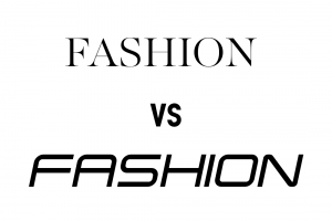
Serif Typeface: A serif typeface has little decorative lines at the top and bottom of a letter. This is more of a traditional typeface
Sans Serif Typeface: A sans serif or sans typeface does not have the decorative lines on each letter. A sans font is what you’re looking at this very moment, it is just a basic font.
Script Typeface: A script typeface for some is better known as calligraphy or cursive for others. They are often fluid strokes created by handwriting.
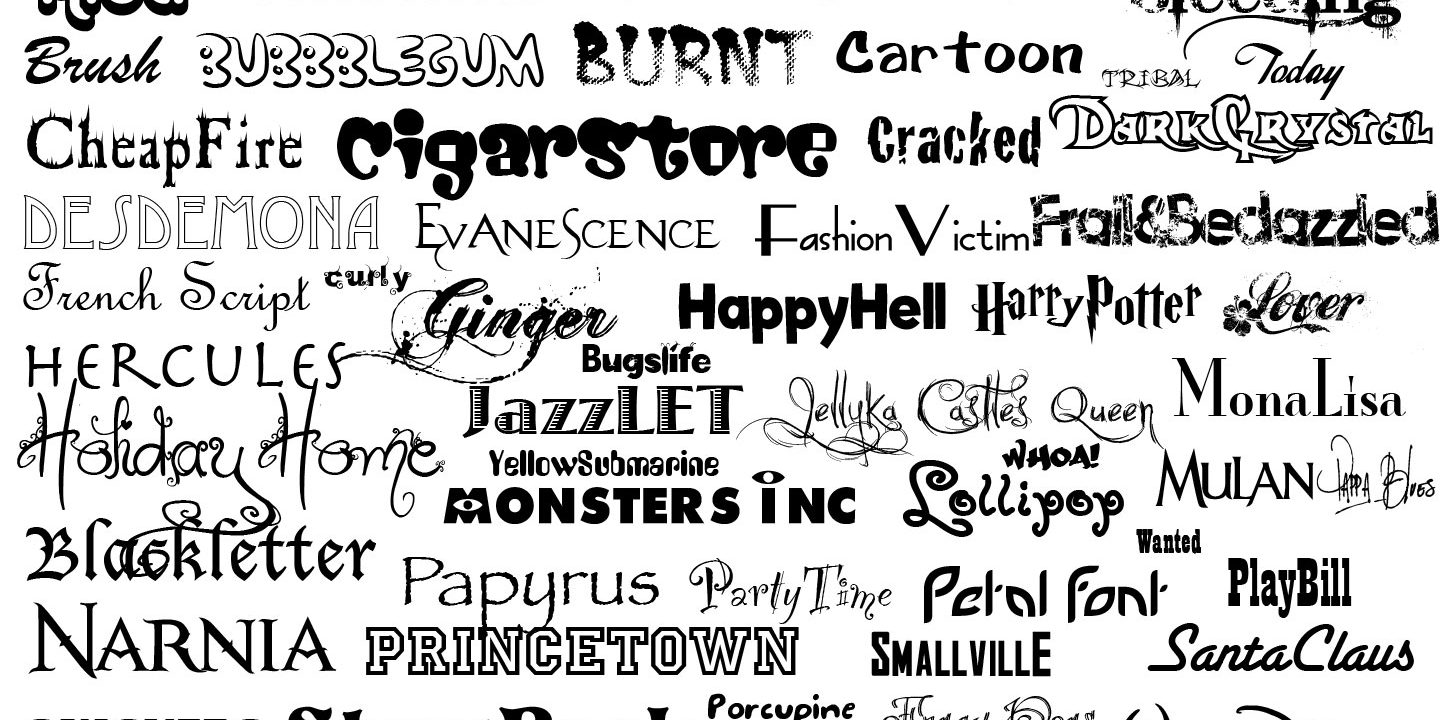
Fancy or Decorative Typefaces: Decorative typefaces are you’re basic fonts with exaggerated features. These type of typefaces are best used for headlines because of all their details.
Mood & Message
When choosing the right font for your website you also have to think about the message you’re trying give and the mood you’re trying to evoke when clients enter your website. Yes, font’s have moods and relay messages. Just think about the mood you feel when visiting a news site. The fonts are pretty basic, they’re basic because they’re not trying to give you the feeling of excitement once you get there. You came there for the news and if abc news were to use a bunch of decorative fonts you would no longer feel like they can effectively tell you what’s going on in your community. You’d probably start to feel like you’re on a blog site that caters to women. So, before choosing your fonts have in mind what message you want to put out there.
Readability
One very, very important factor when choosing the right fonts for your website is to make sure it is legible. You don’t want a potential client coming to your website and the font is soooo tiny you can barely read it. So make sure all font is scalable because you not only don’t want a text that can barely be seen, you don’t want text that is too large either. Text that is too large can be a little challenging for the eyes as well. Size is just one factor when it comes to the readability of text, you also have to be careful about choosing decorative fonts. Decorative fonts are not always bad but they can be if you use them improperly. As stated previously be sure to use decorative fonts as your headers only. Because decorative fonts have a lot of detail, using them as a body of text like this blog post will make it very difficult for your readers to view.
Combinations
While putting your website together you want to be careful about using the same font throughout the design. Using the same font for the entire website will cause your website to look flat and will have no definition; headers and paragraphs will all become one. So before you get started on your website create a style guide and choose the fonts you want to use. You’re going to want to have a primary, secondary, and complimentary font. To be positive they will all work together, compare them to one another side by side. This is not saying that you cannot use the from the same family just be mindful of using the same weights for headers and body content. Some fonts come in regular, bold, and thin mediums, so it’s just a matter of how you combine them.
Be Choosy
Although we’re giving you these tips on choosing the right font for your website we still want you to be choosy. This is your website so you want it to be perfect. So if you want a decorative font use it and if you want to use the same font throughout use it, just be careful how you do it. We’re not telling you not to use the fonts you love we just want you to be mindful of how you position them. And, note that these rules are not ironclad it’s just a guideline on how to use fonts effectively. So you may come up with some rules of your own, this is just a start.


