In the world of typefaces there are so many to choose from. It’s like “Lays” potato chips, “betcha can’t eat just one.” Well I betcha can’t choose just one, I know it’s a bit intimidating. There’s so many and they all speak to you differently.
The fonts you choose says a lot about who you are and what your company stands for, so you want to choose the fonts that will convey the right message to your clients. When choosing the perfect font you have to first choose what you like then take into consideration if it will be able to pair with other fonts easily. So in order for you not to feel so intimidated here’s 4 Tips for Choosing the Right Fonts for Your Brand
Serif or Sans
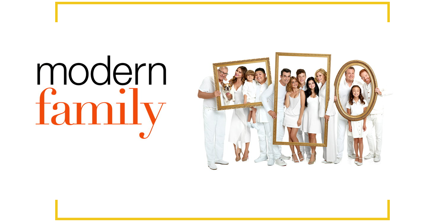
For those who don’t know, a serif font has decorative marks and a sans serif font is basic with no decorative marks. To help you better understand serif fonts have a more traditional element and a sans serif font is much more modern. A great example of this would be the “Modern Family” logo. The “Modern” font is a sans serif and “Family” is a serif. Now that you know what a serif and a sans serif is, deciding on whether your company will be modern or traditional should be easy.
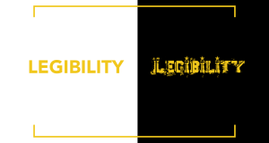
 Legibility
The most important aspect in choosing the perfect font for your brand would be it’s legibility. You want your viewers to be able to read it, right? I know for me, I don’t have the best vision and honestly I don’t want to be squinting more than I have to, to read something. People want to be able to read things quickly or at a glance and get the gist of it. And this is also the most simple thing to determine, if you can’t view the font as good as you would like then, you probably shouldn’t use that font.
Does it Speak to Your Brand?
Before choosing the right font for your brand you must know who you’re catering to. Are you selling bundles or toys for tots. So if you’re selling bundles your font will be more edgy and if your selling toys for kids your font will be more fun and playful. You can’t really go to a woman telling her “I got these bundles for sale” and the packaging looks like “Legos,” you know? She’s going to think that the hair you’re trying to sell her is for a child. But if you’re selling toys the Legos font would definitely be the way to go.
Complimentary or Contrasting Fonts
Usually when it comes to picking fonts for your brand you want to start with your logo. The font used in your logo will be your primary font. And your tagline if you have one, will be your secondary font as well as any other written materials. It should either compliment or contrast with your primary font.
You don’t want to confuse your readers and customers by using two extremely similar fonts. If you want to use the same font for your logo and tagline make sure they’re of different weights and styles. So if your logo’s font is bold you should use a much thinner font for your tagline and vice versa. Often the best thing to do would be to use completely different fonts to give a more contrasting effect.
The font you choose for your brand is going to be with you forever unless one day you decide to change, but you don’t always have to. So I reference fashion house Chanel a lot and I’m going to again because the brands longevity is out of this world. Chanel hasn’t changed their brands font since it was created by Coco Chanel herself in 1925. The branding has lasted so long because the font she chose is modern and will last a lifetime. When Chanel decided she wanted to be for the modern everyday woman there’s no way she would’ve picked a more traditional font. So before you even decide on fonts decide who you want to be and what you want your brand to say to your viewers.


