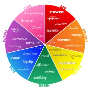
With the millions of colors in the world it can be pretty difficult to pick the perfect color for your business. Most people often decide their brands color by simply choosing their favorite color. And, that is completely the wrong way to do it. Before choosing the proper color for your business you must first understand that all colors have meaning and people perceive them all in different ways. If you pay close attention to the world around you, you’ll begin to notice that certain logos are a particular color for a reason. Let’s use Wal-Mart as an example. Wal-Mart’s company colors are blue and yellow. Now when you walk into Wal-Mart, you’re trusting that they will have everything that you need and you’ll be walking out with a smile. And, that’s exactly how they want you to feel. They chose the color blue because blue is a color of loyalty and trust. They also chose yellow because it’s bright and fun like sunshine and it makes you feel happy. I know you guys remember the smiley face that used to be on all of the commercials.
As a designer, I notice that some of our clients don’t have a clue on which color to choose for their business. Sometimes they don’t even pick their favorite color, they just leave it up to the designer to choose. Now, in some instances this is ok. Especially if you’re working with a highly trained designer that understands the importance of colors to your brand. However, the very best way to ensure that your brand’s colors convey the intentions of your business is to do your research before selecting your brand colors. As stated earlier all colors have meanings, and you don’t want to give the wrong impression. You must remember that first impressions mean everything, especially when it comes to your brand because your brand is who you are.
Now, I know you’re now wondering, “what color is right for my business?” And, I’m going to give you insight on a few colors, and how they make people feel. Hopefully this will help you choose the perfect color for your brand based on the way you want them to feel.

RED: Red is the color of passion, energy, excitement, power, and sometimes anger. Most of the time we view red as the color of love, but too much red can sometimes bring out the anger in us. The color red can also stimulate your appetite, which is why you see some many food chains utilized red in the logos.
ORANGE: Orange radiates warmth. It also means happiness, freedom, and optimism. You’ll often see orange used with travel brands as well as food brands. Orange is such a beautiful color however, too much can bit a much for people to handle, so it is best used in moderation.
YELLOW: Yellow signifies happiness, caution, and intellect. It is also a color that is used to stimulate your appetite or your creativity.
GREEN: Green is the color of life, wealth, balance, growth and positivity. Now on the downside green can also mean greed as it relates to possession and materialistic beliefs. It also relates to nature, and gives a feeling of safety.
BLUE: Blue means reliability, responsibility, trust, and loyalty. It’s not a color that draws much attention, but when you look at it you get this feeling of security and confidence. Blue is such a calming color that enhances our peace of mind and brings tranquility.
PURPLE: Purple is the color of royalty, imagination, and spirituality. It stimulates your mind to bring forth your creativity. It also stimulates your spirituality bringing you closer to self-awareness. Purple gives you a peace of mind by creating balance between your mind and emotions.
PINK: Pink is a combination of red and white. This color promotes love, passion, and nurture. It is also the sign of hope which is why it so heavily used for breast cancer. Pink calms you and alleviates all feelings of anger. Studies have shown that exposure to large amounts of pink not only calms your nerves, but creates a physical weakness. Pink can also bring out the nurturing side of people, whether they’re looking for a little love or ready to give it out.
BLACK: Black is known as the color of many meanings, and promotes various feelings. While some see black as the color of luxury and and power, for others it may be a little intimidating. Often black is used as a color of death and mourning and can be a bit mysterious.
WHITE: White is the color of purity, innocence and equality. It represents both positive and negative aspects of all colors. White is totally reflective and you can’t hide behind it. White encourages inner peace and reminds people of their youth, a time where their lives were a little less complicated.
For a better example on how to choose the right color for your business, take a look at our company logo. When creating the Better Than Success logo we wanted it to stand out and grab your attention that’s why our main color is a shade of yellow. When you see the logo we wanted you to get the feeling of success and to spark your creativity. And, as you’ve read, yellow is the color of intellect and creativity, which is what our brand stands for. Now that you have a better understanding of colors and their meanings, it should help you choose the right color for your business.


